
Instinct Before Image
I started by putting together a 25-page deck: character art, gameplay details, mood boards, and some ideas of my own. Whether it's a piece of art or a professional project, having a clear vision for the finished goal makes collaboration so much easier; it gives everyone a shared vocabulary to work from.
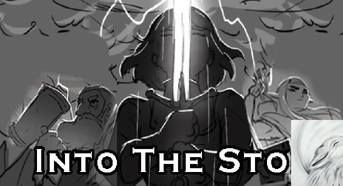
The reference board established the contrast, color, and sense of scale; my rough sketch gave that atmosphere its first shape.
Finding the composition
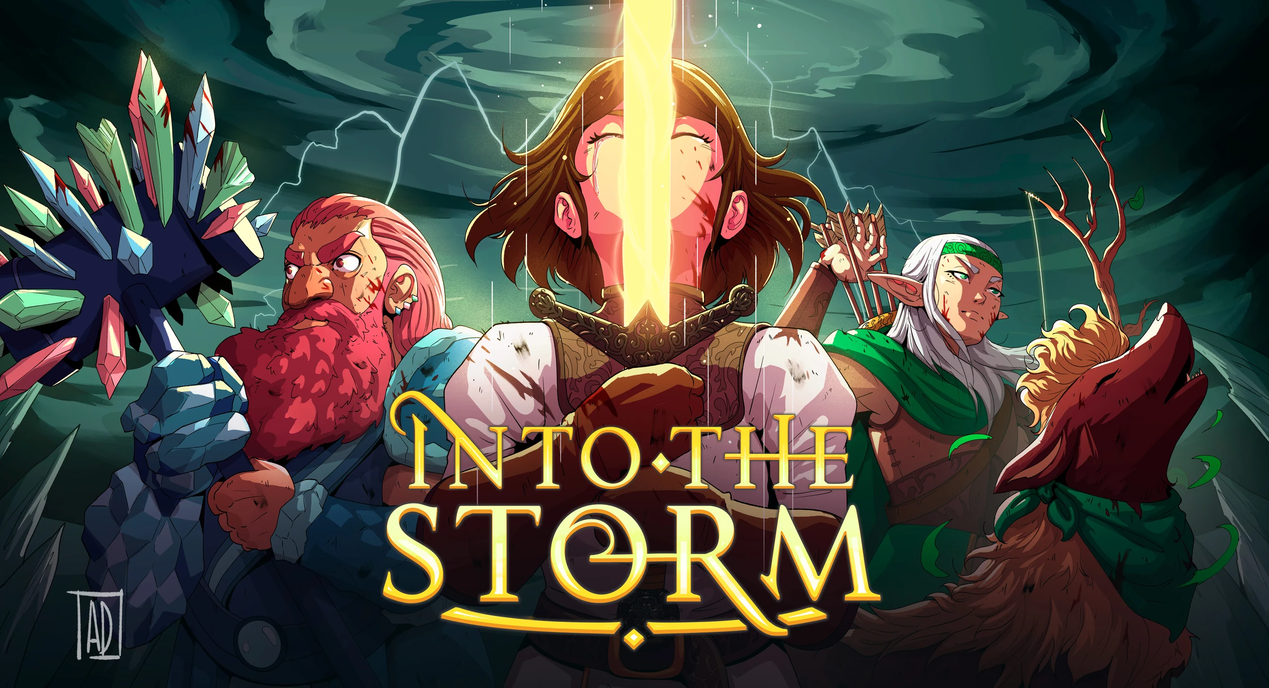
Alejandro explored three different ways into the image. Rather than choosing one unchanged, I pulled together the strongest ideas: composition C's central sword and heroic focal point, with the wider party presence of composition B.
That decision turned the capsule from a portrait of one character into a statement about the whole adventure.
A/B tested the three directions amongst friends, family, and colleagues, who voted 18 to 2 (90%) for composition C as the most eye-catching.
Direction through reference
The feedback became more specific as the identity took shape. For the logo, I referenced thin arcane linework and musical forms rather than prescribing a finished mark. For the sword, I used floral and rose motifs to communicate the kind of ornamentation the world needed.
References gave us a shared vocabulary while leaving room for interpretation.
Precise and Concise Feedback
I used rough visual edits when words alone would have been slower or less precise. The goal was not to redraw Alejandro's work, but to clarify hierarchy, character details, and where the image needed another pass.
Each round moved from broad composition toward smaller decisions without losing the energy of the original concept.
The finished identity
The finished image gave Into the Storm a striking visual identity, surpassing anything I had in mind for the original vision: a battered group of heroes facing an insurmountable, eternal storm, beneath a beautifully ornate wordmark that finally gave the story its name.
The Foundation
Earlier this year I stumbled upon Slay The Robot, an open source framework someone had built and released for free, meant to give new developers a template for a roguelike deckbuilder in Godot. I'd taken a few computer science courses in college and tinkered with programming and modding growing up, but nothing close to the scale of a full video game. Opening that repo and seeing a working combat loop, a card system, an action pipeline, all of it readable and modifiable, was the thing that convinced me that game development wasn't as far out of reach as I'd always assumed.
Over the past year I've rewritten nearly every system: the card and action architecture, the enemy behavior model, status effects, saving, the UI that reads all of it. What's left of the original scaffolding is mostly the idea that this was possible at all.
The part that should have been fun
Enemy design and card design are supposed to be the most creative part of building a game like this. Tuning a boss's attack pattern, deciding what a new card says and does, that's the actual game design. Instead, for most of the first several months, it was the work I found myself avoiding.
Every card and enemy lived as a block of raw GDScript: hardcoded strings, nested dictionaries, action definitions spelled out by hand. Changing one number meant finding it inside a wall of code that looked like this.
Nothing here was unreasonable on the framework's part. It's flexible by design and it got me moving fast in the beginning. But a year in, with dozens of enemies and a growing card pool, this format was actively working against the part of development I cared about most. I'd sit down to balance a fight and spend the first twenty minutes just finding the right bracket.
Building the tool to do the job
Once I understood why I was avoiding it, the fix became obvious: I didn't need a better framework, I needed a better interface between me and my own data.
I converted every card, enemy, and artifact into Godot's native
.tres resource format, which let me define exactly
the fields I actually needed instead of the ones the template
shipped with. Then I built custom in-editor tools on top of that:
a Card Editor and an Enemy Editor, each shaped around how I
actually work rather than how a general purpose framework has to
work for everyone.
Balancing a fight now takes minutes instead of a search-and-replace expedition. Adding a card variant means filling out fields, not writing correct GDScript syntax from memory. More importantly, the part of the job I'd been avoiding became the part I look forward to again.
Ten minutes instead of an afternoon adds up. It's a big part of why Act 1 is finally close.
Frictionless Feedback
The most useful playtest feedback happens at the exact moment a player notices something feels wrong. Asking them to stop, take a screenshot, switch apps, and reconstruct the moment later interrupts the playtesting experience and hinders the feedback collection process. I built feedback directly into Into the Storm so bugs, confusion, ideas, and general notes could be captured without leaving the game.
Submitting a report immediately captures a screenshot of the current game state, logs the surrounding session data, and writes the report straight to Supabase. The screenshot and note also get posted directly to the playtest feedback channel in the Into the Storm Discord server.
Transparent Iteration
The triage system is simple: a ☑️ when a bug is fixed, a 😵💫 when I have no idea what the issue is, and a 👀 when an idea intrigues me. The channel started as a lightweight bug tracker for myself alone, but once I let a few trusted playtesters in for visibility, it was immediately clear that watching me actually read and react to every report overnight increased how much feedback came in.
I've kept the channel open ever since. Reports keep climbing, and I now regularly see 👀 reactions and idea discussions happening among playtesters before I've even had a chance to review the report myself.
In-game form
Game state information, screenshot, note, and tester metadata is collected whenever the form is submitted.
Context captured
Feedback immediately appears in a readable and easy location, for instant visibility.
- DiscordAccountability and engagement driver
- SupabaseGameplay analytics and tester metadata attached to each note
- Local fallbackLog and image are saved immediately on device and can be recovered manually to triage game-breaking crashes.
Whose turn is it anyway?
One recurring point of confusion was card ownership: whose card is this, exactly? Each character's cards already used a distinct color, but playtesters still routinely struggled to tell whose card they were holding at a glance. I tried several ways to make ownership clearer myself, but it took a single feedback report suggesting an obvious-in-retrospect fix, a colored border on each card, to actually solve it.
I ran with that immediately: character-colored glow and a clear highlight on the card's associated hero. Every blind playtest since has confirmed it worked.
Data driven design
The single most common feedback was game balance: runs felt too difficult, players were dying too fast, not dealing enough damage, not seeing good cards. It was valuable to hear, but as a solo developer, tuning damage values, health totals, and card costs was mostly guesswork. None of it was grounded in real data.
I didn't know exactly how to fix that until I found this talk from one of the Slay the Spire devs on their metrics-driven design and balance approach. Given the scope and encounter diversity I already had planned, it was immediately obvious that I needed to borrow that same strategy and let analytics guide me towards a balanced game.
Feedback is only as useful as the context around it, so I built a custom analytics integration: every report is tied to a tester, session, run, app version, platform, build type, act, and floor, among a plethora of other datapoints. A comment about an encounter, card, or economy decision can now be read alongside what actually happened in that run.
Without this shift, I'd still be blindly tuning numbers by instinct instead of letting the data drive balancing decisions, and let the game design instinct be guided by the analytics.
Development continues in Alpha.